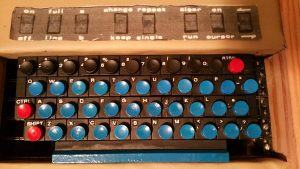
Despite the risks, I stuck with the black acrylic paint. As long as you let it dry fully, it doesn’t eat the plastic key surrounds. Whew. My painting of the keytops to blue went better — that paint (enamel) doesn’t ‘corrode’ the plastic and can be flaked off. My tiny brush did leave some bubbles behind but it’s ok to look at.
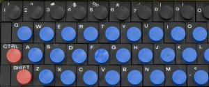
The next challenge was the lettering. Wasn’t sure how Don got his letters on there, although looking at pics on the museum site zoomed in all the way it looked like they were cut from a sheet and then adhered to the key surrounds. Could be dry transfer too (I’ve not touch dry transfers since I was in short pants!)
I decided to try to replicate Don’s work using Avery label stock. However the fonts were a problem. They do have services where you can upload a small jpeg of the font you’re trying to find and it’ll do its best to match it. Unfortunately this particular font was impossible to locate. In the end, I decided to just ‘lift’ the font from the museum photos, photoshop it and then print it.
The next trick was just figuring out what to print it with. I wanted to get the correct ‘sheen’ to match the paint on the surrounds, so initially I thought inkjet + glossy label paper. Nope. Came out way too bright. So then I went laser on non-glossy. Ah. Not perfect, but looked better. I printed basically the image above, used an Xacto to cut away the individual letters and then stuck them on. They look pretty good — the only annoyance was the white edges. I got rid of that using a fine black marker. Result: not bad!
That’s about as far as I can go with the case until I get the boards built. There are still some unanswered questions I think only having the physical boards will answer.


